Showing posts with label workspace. Show all posts

Friday, September 9, 2011

Lesley Moon


For her interview, we asked Lesley Moon to describe the process of creating her show, Tortoise – On – Domino, in detail.

LM: I suppose the place to start would be with the salt [Coruscated Salt]: a piece made up of hundreds of pounds of Himalayan pink salt spread out across the floor, which created a grounds for the exhibition. Out of that, the other works sprang up!

The first thing I can remember making after I had the salt in mind was a sculpture of a silicone rabbit held up on steel rods called BunBun. I had been thinking for years about ways to eroticize the space between the wall and the floor, entertaining all kinds of variations as a kind of mental sport. For this show, it began when I was shopping at the Pleasure Chest with a friend for sculptural objects, amongst other things. I grabbed this little rabbit that was supposed to fit onto the tip of a dildo (it was in a tiny ziploc bag!) - but I found the object replete for whole host of other possibilities - so fresh and available for use. I decided to weld these three rods together to form a tripod and put the rabbit on top of that. I had an aluminum rod gently arc out of the wall in a way that might reference furniture or the arm of a lamp. I attached a peacock feather to that, so it would just barely touch the tips of the rabbit’s ears. In this way the rabbit was being constantly both penetrated and tickled - and held in a delicate counter-position to it’s original purpose.

Then I thought it would be nice to incorporate a slab of marble next to the rabbit - a very traditional Carrara marble that’s been used in sculpture for hundreds of years. I conceived of it as a smoky mirror, or dim looking glass. I leaned it against the wall, so that with BunBun there could be a coupling of pieces that connected the wall and the floor, but this one was had four right angles, along with some extreme material weight and discursive history as an object for use within sculpture.

Next came the rings, they're called FYA #1, referring to both “For Your Art” and “For Your Ass.” I had been thinking a lot about therapeutic objects, especially as I was making BunBun. You can get these inflatable rings for hemorrhoid pain and other posterior ailments: you sit on them, and I think the goal is to help one continue daily seated activities whilst afflicted. I cast a few of them in concrete, half-stacked and half-splayed them around one corner of the space. They were dipped in bright blue tempera paint on one side, which I thought might give them this sort of secret, connective vanity, as they were stacked with their blue markings largely outside of the dominating sight-lines. 


Then there is the prepared game of pick-up sticks. I call it a ‘prepared game’ since I striped all the sticks before I dropped them, which primarily subverted the overriding logic of the game (to pick up one’s color sticks). I photographed them this way and hung the photograph to invert the original perspective, so that the game was upside-down. This way it wouldn’t adhere to a logical sense of space, or ‘looking into’ when looking at the photograph. In this way, the sticks appear to be stuck against a wall or stuck up against a ceiling. They reference something that is at once graphic, abstract and representative. I hung the photograph low on the wall, allowing the bottom of it to droop onto the floor and curl up - maybe another moment for relief or support... 


And then there was the tortoise! A tortoise is a perpetually ancient creature, but also an abiding sign of time, living a life that extends beyond the parameters of human lifespan. They look old from the day they are born; they are never creatures of youth. All the rest of the work was also made at such a scale that the tortoise could access it - closer to his scale instead of our human scale. Not to undermine the greatness of the species, but significantly - according to the choice words of a few tortoise-keepers I met - in our eyes, they also more or less behave like rocks that happen to eat. During the opening, if the tortoise wasn’t up and walking around, people were very concerned with the tortoise’s disinterest in socializing. It was fascinating to see so much pathos extended to a thing that has so little in common with our wants and desires, our culture and our projections - it seemed a bit hysterical, but of course I kind of completely identified with that sense too. Alienation or estrangement within viewership has always been a compelling element for me within the cultural field, and as someone making things - and to some degree, I think it gave the tortoise extra agency within the environment as a more entitled participant. I should mention that an animal enrichment specialist who owned the tortoise had sanctioned him to be there. He had just come out of hibernation, and to whatever degree he could experience pleasure, maybe he experienced the pleasure of discovering a salt floor, strewn with lettuce, with a whole host of objects to be explored within its bounds. To me, the traversal of the tortoise across the space, between the other objects and across the salt became an important, active intersection within the show, something that created a persistent, quixotic question for me. 

To go back to the salt, there was a sense of mineral time at play, working in relation to the concrete and marble, amongst other materials in the show. More than mere currency, in history salt was prized as a necessity - it brought survival because of its properties to preserve food - material currency! Now of course, I think most people just love the taste of finishing salt (the first thing that hits the palette!) and the color pink - of course, even Trader Joe’s markets and sells the stuff. But on the ground, as the tortoise’s feet and our shoes crossed through it, the salt made a sound and registered the marks made by each step. I thought of the sliding and continual elision of this index along with the pick-up sticks and some of the more ambiguous indices referenced within photography - the presence of the body, questions of what can be made and heard, when and where process is registered, things going away, and things kept.

Finally, I painted the walls and floor dark grey because I was looking to create a bit of a visual recession within the environment. The elements in the space could then function in contrast to a shadow tone. It was about creating or emphasizing a containing space - outlining, as it were, an area to be filled. 

More about Tortoise - On - Domino here.

[all Lesley Moon. top to bottom: BunBun, 2011. Untitled, 2011. Tortoise - On - Domino, 2011.]

Thursday, September 8, 2011

Cameron Crone


Workspace: I know you’re trained as a photographer. Can you talk about how you went from a more traditional photographic practice to making sculptural and more installation based work?

Cameron Crone: I was trained as a photographer, but I never made photos like Lee Friedlander or Robert Frank. By that, I mean I never had a mode of working where I would go out into the world and make photographs intuitively. I made photos of specific things that I was drawn to for their sculptural properties. With the series Touchfree, I photographed automatic car washes, which are super decorated minimal structures. Ultimately, I was more interested in the objects than in the work’s photographic qualities.

Then, I started collecting these gnarled sticks and photographing them against patterned fabric backgrounds. Eventually, I took the sticks out of the pictures. I ended up with these quasi-abstract Op-Art photographs, and in studio visits, people kept asking me how these images would exist out in the world. Up until that point I had printed everything on traditional photo paper, but I decided to print these works out on fabric. I liked that they were pictures of fabric printed on fabric, and the transition from photo paper to fabric brought them into a dialogue with painting.

With this work, I began considering the way the photo sat as an object in the world, and that opened the door to working with sculpture and installation. Now I tend to sit with my photos a little longer. Sometimes they end up as part of a sculpture, sometimes they end up as a photo in a frame. I wait and see what the work wants.


WS: In your Workspace show, there seemed to be a combined interest in Op Art and the singular viewpoint of a camera. Can you talk a little bit about how you were thinking about optics and looking? Also could you talk specifically about how you arrived at your title: Object, Image, Room, Wood, Etc.

CC: Before my show, I was thinking about how installation work is always presented through a single image, and that one photograph becomes representative of the installation. For my Workspace show, I wanted to complicate that. I wanted the installation to be photographed in a way that made sense, but when a viewer was in the space or engaging it from the street, it would offer a more disorienting experience. I also was engaging with Op Art again, but instead of the stark black and whites or the tricky color combos that those artists used, I used photos made by scanning the end of a piece of white ebony wood. That image had this visceral surface quality that I liked and responded to. I used this scanned image and made a concentric square pattern from it, putting something gestural into Op Art.

I tend to give my pieces titles that are the simplest descriptors of what the piece is. I am drawn to the humor of a flatfooted title, where it lays bare all the components of a piece. The title, Object, Image, Room, Wood, Etc. described everything I was incorporating and thinking about in the installation. What was primary here? Do I think of it as a sculptural object, is it a photograph, is it dealing with the architecture, or is it about the piece of white ebony? I really didn’t know, so I gave it a title that mirrored my uncertainty.


WS: In your work the subject matter seems imbued with a Southern Californian boyishness. Can you talk about how your surroundings and where you grew up inform your work?

CC: In learning about art history, I responded strongly to the work of Southern California Conceptualists such as John Baldesarri, William Wegman, Ed Ruscha, et al. When I first encountered their work, it shocked me. All I could think was, “This is Art?” It wasn’t because of the aesthetics, but because my high school friends and I had done a lot of similar hijinks that shared the same irreverent attitude.

I also grew up in Temecula, CA, an exurb city that mushroomed overnight. It was really boring and quotidian, and lacked any sort of cultural stimulation. Temecula was also the type of city that would have a KFC decorated with a wild west facade. Next to it would be a Taco Bell done in some weird watered-down postmodern architectural style. But, the interiors of the buildings would be identical: the same chairs, floor, ceiling, soda machines, etc. Things really seemed to be about surface, and that has remained a concern in my work.

Growing up in this environment, you have to do things that puncture the mundane membrane, or else you will go crazy. Some of the things I did to fight boredom: building bike ramps, drawing on magazine photos, etc., have popped back up in my work in strange and unexpected ways.

More about Object, Image, Room, Wood, Etc. here and more of Cameron Crone's work here.

[all Cameron Crone. top to bottom: 2nd & Pacific Coast Highway, from the series Touchfree, 2008. Object, Image, Room, Wood, Etc., 2011. Horse Head, from the series Raster Splash 2011.]

Wednesday, September 7, 2011

Bobbi Woods


Workspace: Your work seems to revisit a dark elegance in cinema, the mood is reminiscent of a 1940s noir film. Could you discuss your relationship to cinema and its ephemera?

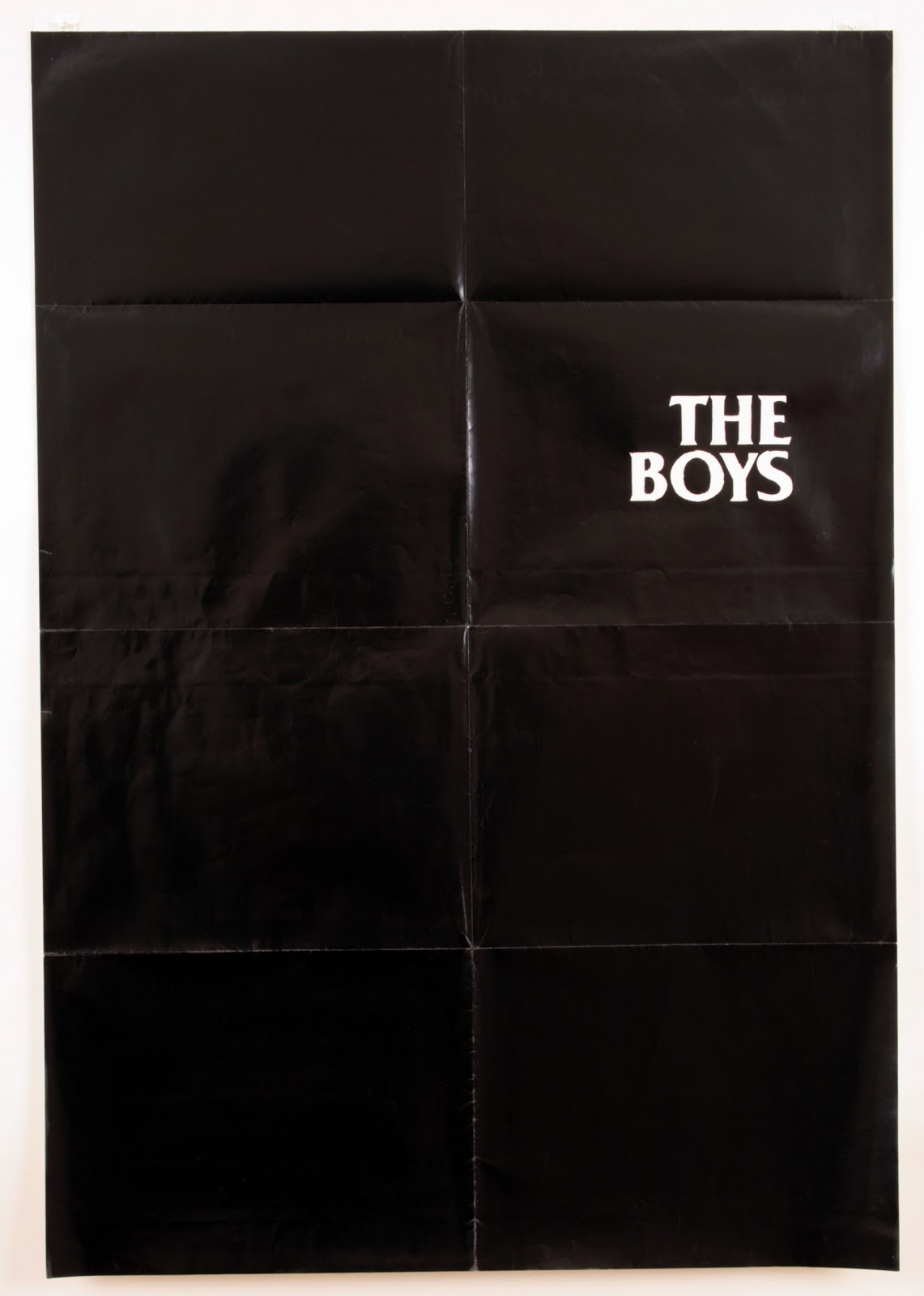
Bobbi Woods: My relationship to cinema exists tangentially. I have an affinity for movies, of course, but I rarely watch the ones from the posters I use. The format of the movie poster is appealing, as is its function to announce something that is going to come, but has yet to arrive. They retain a basic reference to, and are suggestive of, the immersive atmosphere of film, while having little if anything to do with the films they once promoted. The work uses the structure of the poster, and also its possibility to function seductively, but they become something else.


WS: In the video, California Light, sparse sounds and text seem to stand in for narrative, plot, and character. Can you talk about the process of editing or removing visual information?

BW: The video, California Light, is part of the Noir series I have been working on, which basically began as a pun, a kind of dry reduction of the genre into darkness (noir). I was inspired by the atmosphere of uneasiness, dread, and uncertainty produced by the stark contrasts of chiaroscuro and sharp angles within its cinematic composition. I liked the idea of creating a similar kind of space using only subtitles and sound (effects) surrounded by the (black) darkness of the screen in which, if there is a voice, it shifts without settling into a particular character. It could be male, or female, or neither, but just kind of moves in-between. The "I" and the "eye" are interchangeable. I also thought about Louise Lawler's A Movie without the Picture. As for process, I cull from film scripts, poems, artist writings, and combine those with my own writing, sometimes rewriting parts of what I appropriated. The process can feel like what I imagine sculpting may feel like, as there is a tactile molding and shaping of the text which occurs along the way. I think about it becoming kind of spatial as it relates to narrative, as it can draw you in or else remain flat due to dry reiterations. I will have ideas in mind of what I am going for and proceed to seek text out along those lines, and then add to it. While the visual image is removed, it is still present within my narrative. It will refer back to itself, aware of the dark space in which it is occurring.


WS: Can you talk about the poster piece you made for Dark Glasses, your Workspace show? The piece seemed to be a shift in your practice, from altering actual movie posters to photographing them.

BW: It was really exciting to work with you because the show evolved specifically for Workspace and as per your suggestion, different from what I had been doing. We decided on very few elements: one poster, one projected video, and the DVD Noir:Dark Glasses edition as a sculptural take-away. Using a video still of one of my other pieces, then zooming in and enlarging it to standard movie poster size was an interesting way to utilize the format in a self-referential way. We had titles like California Light and Dark Glasses, and so the black and white poster was in service to the chiaroscuro and the sort of hiding and revealing already in place. The composition reiterated some of the polygon shapes I used in several posters I made previously, and from which the design for my first show announcement at Fourteen30 Contemporary was derived. I wanted to cull from these elements and fold this form back into my work. The kind of degraded video texture apparent in the piece provided a close connection to the other seen or unseen video elements in the room, in a basic material and spatial way. 

More about Dark Glasses here.

[all Bobbi Woods. top to bottom: The Boys, 2010. Still from California Light, 2010. Fade Out, 2010. Courtesy of the artist and Annie Wharton Los Angeles]

Monday, September 5, 2011

Davida Nemeroff


Workspace: You started Night Gallery, a nocturnal exhibition space in Los Angeles. It seems like this has influenced your process and more specifically, your show at Workspace.

Davida Nemeroff: Consistently putting together exhibitions at Night Gallery helped me put together my Workspace show in terms of the placement of things and creating a feeling. I was very much against the idea of an “installation.” You were like, “I consider this to be an installation” and I was like, “no, it’s a show!” And Night Gallery is more than a nocturnal space; it’s a sort of surrealist place, a place of paint dripping, a funhouse.

WS: When I asked that question I was thinking-

DN: How the spaces are opposites?

WS: Right. Night Gallery is dark and has black walls, and Workspace is basically a white cube. But you used similar tactics in both spaces.

DN: … And I painted the white space pink.

WS: Laughs. Yes.

DN: It definitely influenced my tactics, that’s a good way of putting it. There were a lot of the same things involved. It had to do with framing, and using the whole wall to frame a piece. That’s how it became an installation because the walls were frames. That understanding of a wall came from smoking a lot of pot at Night Gallery, staring at the walls of the space and understanding what a space is. In terms of color, I found the two colors, the darkness and the magenta, were equal. You could say that they were opposites, but they were opposites to the point of being equals, just because they both took over the white space. Both Night Gallery and Workspace are white spaces- Night Gallery is just painted black. They’re both exhibition spaces that deviate from the idea of the white cube. Workspace’s size or Night Gallery’s hours; those are the mechanisms that you’re working with.

WS: What about the individual photographs in the show?

DN:  First and foremost, Daniel and Paul, you were the first people to show my work in LA, at Workspace Selects. The first piece I made was so bizarre that I could go anywhere from there. I made that watermelon piece with that awful mauve, pink, and gold frame, and it was in the heaviest glass. It was so insane.


WS: That was one of my favorite pieces in that show. And that frame foreshadowed other work that you ended up making.

DN: That piece was way over the top because I really wanted to assert this idea of the frame. I’m interested in the frame, and I’m interested in staring, so the photographs that were in Potpourri, the two images, the picture of the potpourri and the roses, both directly suggest the idea of transfixion. They’re both super formal, they were lighthearted, and they were very pedestrian. One was staged, one wasn’t- what’s the difference? The show at Workspace, wasn’t about women’s rage, it was much more… what did you call it?

WS: Well, there was this Georgia O’Keeffe thing going on, it’s like a vagina, but it’s not?

DN: It’s like a pulsing, vibrating vagina. It’s like a vagina but it is.

WS: It was a clashing of different kinds of femininity. A lot of the things you were working with were feminine kitsch.

DN: I guess that’s the cliché. Feminine kitsch. Right now in my studio I’m surrounded by all of this grayness, but that’s still where I’m at, it’s still the same topic. My work is about the objectification of a subjectivity, creating and showing one way of seeing, breaking up how to see. It hasn’t always worked, but that’s always been my dream. The Workspace show might have been too forcefully through the orifice, I was overzealous about wanting to do that. But that’s what was really great about it, it’s scale, because it was the most outlandish, the pink-est, brightest show that I’ll do for a while.


WS: What are you working on now?

DN. My new work is limited to the zoo. Within the zoo I’ve found a limitation- deconstructing what it is to look at something. So there is this coy structuralist procedure going on. I don’t want to repeat things that have already been destructuralized in looking, I want to add.

I don’t want to be didactic. I don’t want it to be puns, I want it to be poetry. I want it to exist on its own, I want it to work. I don’t want it to be just me that sees it. I’m trying to create a subjectivity for other people. I really feel like how much femininity I was putting into the Workspace show was part of asserting the female, the constantly and continuously misunderstood species. That was part of being a feminist without partaking or aligning myself with any wave of feminism: not apologetic, post-castration, post the ideas of castration, being there. And that’s what the Workspace show was, it was the idea of the average ladies’ night. And then it’s time to get more serious about that. Not about pointing fingers, or fluffing up one’s self or gender, not even taking into consideration the oppression, just moving past the depression.

More about Potpourri here and more of Davida Nemeroff’s work here

[all Davida Nemeroff. top to bottom: Roses, 2010. Invagination: Dusted Pink, 2009. The Ear, 2011. Courtesy of the artist and Annie Wharton Los Angeles]

guest blogger • workspace


founded in 2008 in los angeles, workspace is a gallery that invites artists to realize exhibitions, installations, performances, and curatorial projects. it is run by daniel ingroff, paul pescador and david gilbert.

workspace's main focus has been to provide opportunities for artists to realize solo exhibitions. in the last year, workspace has mostly shown artists engaged with the expanded field of photography, which has manifested in work ranging from site-specific installation to sculpture and video. in the next week, they will post interviews with eight of those artists here at i heart photograph.

workspace is located at 2601 pasadena ave in L.A., and will reopen this fall with 'the land before time', featuring work by erich bollmann, samantha contis, and nick lowe on september 16, 2011. more info here.