Showing posts with label interview. Show all posts

Sunday, September 11, 2011

Marina Pinsky


Workspace: Could you talk about your process and what draws you to the still life? I know you photograph elaborately constructed tableaus. Can you talk about their relationship to sculpture?

Marina Pinsky: What drew me to this genre initially was that I wanted to create a historical narrative with images of food that eliminated the neutral environment of a typical product photograph. So, the first such photos I made really were elaborately constructed period pieces, that period being the "cold-war era." I made backdrops of collaged images to provide the still lives with a specific historical context. The photographs also had stacks of books, the titles of which pointed to different possible lineages for the objects they were propping up. They were massive constructions that were trying to take what I would previously have made a photographic series and condense it into one photo. But the possibilities of working with still lives grew when I started to think more formally, rather than historically, about each element of the photograph. I've since been using new methods of collage, decollage, painting and drawing within the backdrops. I've also been building objects to be photographed, casting bottles or altering packages. I don't think making props makes the photographs sculptural, but I do think that altering the space the props inhabit does. As I learn how malleable the space of a photograph is, the pictures become more and more sculptural.


WS: In the past you’ve made a series of photographs that dealt with Soviet-era Russia. Could you talk about the struggle of representing the culture of a country in your work?

MP: I was born in Moscow and I've tried to understand my relationship to the culture of that city in some works, but it is always very problematic. I can't represent Soviet culture from memory or experience. I have only borrowed experiences of Soviet culture from literature, art, film and anecdotes. In the past, I have photographed physical traces of Soviet culture in contemporary Russia. These images have always just showed these remnants in relation to another culture. Even the still life from last year with Soviet groceries was half of a diptych and had an American parallel. These photos quite generally showed how two cultures once sold fear and didn't have a specific analysis of the culture on either end. For now, I am less interested in mining the archive of Soviet culture and more interested in watching the rapid development of contemporary Russian culture. 


WS: What first struck me about your work is that it seems to draw you back to a specific place or time. Could you talk about the role of nostalgia in your work?

MP: My work attempts to draw a line between processing history through making an image and generating false nostalgia from an otherwise banal object. I don't want to create a fetish through the way I photograph an object. Formally, my photos tend to flatten things out, to mix things together optically and to privilege the containers of things rather than the things themselves. I don't photograph objects the way I do to give them any mystical significance or to elicit any sort of judgment of taste about these objects. I just want to slow down the way people look at the prints so they can study these objects and consider the histories that brought them into the world.

Marina Pinsky's solo show at Workspace opens on November 5th, 2011.

[all images Marina Pinsky, 2011]

Jo-ey Tang


Workspace: What was the premise of Leverage? How did it develop and where did the title come from?

Jo-ey Tang: Paul Pescador proposed his traveling curatorial project Hollowing to The Notary Public, an apartment space that I started in 2010. I took that as an opportunity to propose a two-part exhibition to Workspace. You could say that I was leveraging my way. As artists who are involved in a multiplicity of endeavors, there’s always an unspoken but open conflict of interests. So Leverage doesn’t only refer to the New York and Los Angeles sites, but points to this fact of being an artist who exhibits, organizes shows, and runs an art space, etc. The word “leverage” also has physical, economic, social, and psychological resonances; think of it as an energy source that generates both the meaning of form and the form of meaning.

For the exhibition, I asked four New York-based artists Sonja Engelhardt, Luke Stettner, Gustabo Velazquez and Claudia Weber to create works for both sites, which turned out to have the same square footage. I am interested in the potential of an exhibition that is fractured, split, and unresolved. It is conceived with the knowledge that viewers would only experience in person just one of the two sites. The other site would have to be imagined, and later experienced online. 


WS: How do you think your role as a curator informs your artistic practice?

JT: “Curator” somehow doesn’t feel like an appropriate term. The Notary Public took place in my apartment, and it allowed me to think and move through ideas, conceptually and spatially. The artists were my accomplices. There had been a few shows in over a year, and a reading by Wayne Koestenbaum in Central Park, at the tree where Jackie Onassis Kennedy was photographed by the paparazzi Ron Galella. The reading took place on a stormy Monday last October, on the 29th anniversary of the photographs. There was no one in Central Park but the fifteen of us that gathered that evening. We traced the route of the paparazzi chase. Photography was not allowed. Wayne read the last paragraph from his book Jackie Under My Skin and then we dispersed in the rain.

As of now, The Notary Public is without a home, on the streets of Paris, waiting for something, anything, to happen.


WS: Can you tell us about the work in your current show at Exile

JT: I was preparing for the Exile exhibition when I conceived of Leverage. For Exile, there is two gallery spaces – one full and open to the public, the other empty and inaccessible. Je Suis Une Bande De Jeunes is also publishing a book of images for its BlueZines series to coincide with the exhibition.

More about Leverage here and more of Jo-ey Tang's work here

[top to bottom: Leverage installation LA, work by Gustabo Velazquez and Claudia Weber, 2011. Leverage installation NY, work by Gustabo Velazquez, 2011. Jo-ey Tang, Untitled, 2010.]

Saturday, September 10, 2011

Betsy Lin Seder


This interview is a continuation of an earlier conversation between Betsy Lin Seder and Workspace. 

Workspace: What is your process when developing a project or a body of work? Your past projects have been extensively researched. What role does that research play in the presentation of that work?

Betsy Lin Seder: I pursue a project with a certain concept in mind—for example traces of fascism in a Roman suburb, or ambivalence about a modernist domestic space, or fantasies and failures around "The Californian Dream"—and research the subject and its tangents. I become a collector of books, films, locations, museums, images, people and filter it all through the particular idea that I am working with. Distraction, serendipity and surprise play a large part in the final form.

My goal is for the work to be experienced, understood and read on multiple levels. I use the titles to point to the photograph’s conceptual framework (rather than just the depictive content of a photograph), but intentionally leave room for a wide range of interpretation. While there are concepts, intellectual concerns and references that drive the production of the work or ground it within a particular arena of meaning, the viewer’s immediate aesthetic encounter with the work is primary. I put a lot of consideration into the affect with which I am depicting something. 

For example, the image Vasquez Rocks, Stardate 3025.3 is an image of a rock formation north of Los Angeles that was taken just as the sun was setting. The pinkish hues and tight cropping give it a sense of unearthliness and plasticity. The title both names the actual location that is photographed while also pointing to its fictional existence as a set for a 1966 Star Trek episode in which a small team investigates a new planet. During their visit, their life long fantasies begin to come true and harm them. This photograph is part of a series about the fantasies and disappointments of the Californian Dream; the experience of this site is not only located in its actual existence, but also in its fictional ones. To that end, I embrace the photograph’s unreliable status – the content is both there/not there, real/not real - and put into question the limitations of what a singular (or series) of photographs alone can communicate. I use that space of ambivalence to generate meaning. 


WS: There seems to be distinct moods you’re invoking in the different photographs you take; could you talk about the visual vocabulary you use and how it changes from piece to piece? 

BLS: There are stylistic consistencies through my work, but indeed, the mood mutates between series. These shifts tend to come from formal approaches that express the concept. For example, in the Fool’s Gold photographs, I was interested in teetering between misrecognition and partial recognition of the object using cropping and color to abstract it and intensify its gold likeness. When I photographed the eucalyptus tree in Imposter (from the Poltergeist Project) I used a day-for-night filter to indicate fakery, cinema and horror films. 

I also want to challenge the form of a series and a certain consistency that is expected from photography.  I am making associations between disparate images and subject matter whose connections are not immediately apparent, evoking meaning through the interstitial spaces and the ambivalences that grow out of that.


WS: You mentioned that your work deals with aspiration and disappointment. Can you talk about your relationship to success and failure in the photographic process?

BLS: Disappointment is the moment that illusion clashes with actuality. It’s a shattering of fantasy and a revelation of the real. And certainly, one’s experience of a site (or a person, or an event) is always woven with illusions, expectations and fantasies. I emphasize the photograph’s wobbly status as a reliable index to address that hazy space. Through specific composing and post-production manipulations, I create these images to refer to the actual physicality of space or objects photographed as well as the real and fictive narratives that produce meaning around those sites. 

More about The Elephant here and more of Betsy Lin Seder's work here

[all Betsy Lin Seder. top to bottom: Vasquez Rocks, Stardate 3025.3, 2011. The Imposter (Poltergeist), 2011. Fool's Gold #2, 2011.]


Friday, September 9, 2011

Lesley Moon


For her interview, we asked Lesley Moon to describe the process of creating her show, Tortoise – On – Domino, in detail.

LM: I suppose the place to start would be with the salt [Coruscated Salt]: a piece made up of hundreds of pounds of Himalayan pink salt spread out across the floor, which created a grounds for the exhibition. Out of that, the other works sprang up!

The first thing I can remember making after I had the salt in mind was a sculpture of a silicone rabbit held up on steel rods called BunBun. I had been thinking for years about ways to eroticize the space between the wall and the floor, entertaining all kinds of variations as a kind of mental sport. For this show, it began when I was shopping at the Pleasure Chest with a friend for sculptural objects, amongst other things. I grabbed this little rabbit that was supposed to fit onto the tip of a dildo (it was in a tiny ziploc bag!) - but I found the object replete for whole host of other possibilities - so fresh and available for use. I decided to weld these three rods together to form a tripod and put the rabbit on top of that. I had an aluminum rod gently arc out of the wall in a way that might reference furniture or the arm of a lamp. I attached a peacock feather to that, so it would just barely touch the tips of the rabbit’s ears. In this way the rabbit was being constantly both penetrated and tickled - and held in a delicate counter-position to it’s original purpose.

Then I thought it would be nice to incorporate a slab of marble next to the rabbit - a very traditional Carrara marble that’s been used in sculpture for hundreds of years. I conceived of it as a smoky mirror, or dim looking glass. I leaned it against the wall, so that with BunBun there could be a coupling of pieces that connected the wall and the floor, but this one was had four right angles, along with some extreme material weight and discursive history as an object for use within sculpture.

Next came the rings, they're called FYA #1, referring to both “For Your Art” and “For Your Ass.” I had been thinking a lot about therapeutic objects, especially as I was making BunBun. You can get these inflatable rings for hemorrhoid pain and other posterior ailments: you sit on them, and I think the goal is to help one continue daily seated activities whilst afflicted. I cast a few of them in concrete, half-stacked and half-splayed them around one corner of the space. They were dipped in bright blue tempera paint on one side, which I thought might give them this sort of secret, connective vanity, as they were stacked with their blue markings largely outside of the dominating sight-lines. 


Then there is the prepared game of pick-up sticks. I call it a ‘prepared game’ since I striped all the sticks before I dropped them, which primarily subverted the overriding logic of the game (to pick up one’s color sticks). I photographed them this way and hung the photograph to invert the original perspective, so that the game was upside-down. This way it wouldn’t adhere to a logical sense of space, or ‘looking into’ when looking at the photograph. In this way, the sticks appear to be stuck against a wall or stuck up against a ceiling. They reference something that is at once graphic, abstract and representative. I hung the photograph low on the wall, allowing the bottom of it to droop onto the floor and curl up - maybe another moment for relief or support... 


And then there was the tortoise! A tortoise is a perpetually ancient creature, but also an abiding sign of time, living a life that extends beyond the parameters of human lifespan. They look old from the day they are born; they are never creatures of youth. All the rest of the work was also made at such a scale that the tortoise could access it - closer to his scale instead of our human scale. Not to undermine the greatness of the species, but significantly - according to the choice words of a few tortoise-keepers I met - in our eyes, they also more or less behave like rocks that happen to eat. During the opening, if the tortoise wasn’t up and walking around, people were very concerned with the tortoise’s disinterest in socializing. It was fascinating to see so much pathos extended to a thing that has so little in common with our wants and desires, our culture and our projections - it seemed a bit hysterical, but of course I kind of completely identified with that sense too. Alienation or estrangement within viewership has always been a compelling element for me within the cultural field, and as someone making things - and to some degree, I think it gave the tortoise extra agency within the environment as a more entitled participant. I should mention that an animal enrichment specialist who owned the tortoise had sanctioned him to be there. He had just come out of hibernation, and to whatever degree he could experience pleasure, maybe he experienced the pleasure of discovering a salt floor, strewn with lettuce, with a whole host of objects to be explored within its bounds. To me, the traversal of the tortoise across the space, between the other objects and across the salt became an important, active intersection within the show, something that created a persistent, quixotic question for me. 

To go back to the salt, there was a sense of mineral time at play, working in relation to the concrete and marble, amongst other materials in the show. More than mere currency, in history salt was prized as a necessity - it brought survival because of its properties to preserve food - material currency! Now of course, I think most people just love the taste of finishing salt (the first thing that hits the palette!) and the color pink - of course, even Trader Joe’s markets and sells the stuff. But on the ground, as the tortoise’s feet and our shoes crossed through it, the salt made a sound and registered the marks made by each step. I thought of the sliding and continual elision of this index along with the pick-up sticks and some of the more ambiguous indices referenced within photography - the presence of the body, questions of what can be made and heard, when and where process is registered, things going away, and things kept.

Finally, I painted the walls and floor dark grey because I was looking to create a bit of a visual recession within the environment. The elements in the space could then function in contrast to a shadow tone. It was about creating or emphasizing a containing space - outlining, as it were, an area to be filled. 

More about Tortoise - On - Domino here.

[all Lesley Moon. top to bottom: BunBun, 2011. Untitled, 2011. Tortoise - On - Domino, 2011.]

Thursday, September 8, 2011

Cameron Crone


Workspace: I know you’re trained as a photographer. Can you talk about how you went from a more traditional photographic practice to making sculptural and more installation based work?

Cameron Crone: I was trained as a photographer, but I never made photos like Lee Friedlander or Robert Frank. By that, I mean I never had a mode of working where I would go out into the world and make photographs intuitively. I made photos of specific things that I was drawn to for their sculptural properties. With the series Touchfree, I photographed automatic car washes, which are super decorated minimal structures. Ultimately, I was more interested in the objects than in the work’s photographic qualities.

Then, I started collecting these gnarled sticks and photographing them against patterned fabric backgrounds. Eventually, I took the sticks out of the pictures. I ended up with these quasi-abstract Op-Art photographs, and in studio visits, people kept asking me how these images would exist out in the world. Up until that point I had printed everything on traditional photo paper, but I decided to print these works out on fabric. I liked that they were pictures of fabric printed on fabric, and the transition from photo paper to fabric brought them into a dialogue with painting.

With this work, I began considering the way the photo sat as an object in the world, and that opened the door to working with sculpture and installation. Now I tend to sit with my photos a little longer. Sometimes they end up as part of a sculpture, sometimes they end up as a photo in a frame. I wait and see what the work wants.


WS: In your Workspace show, there seemed to be a combined interest in Op Art and the singular viewpoint of a camera. Can you talk a little bit about how you were thinking about optics and looking? Also could you talk specifically about how you arrived at your title: Object, Image, Room, Wood, Etc.

CC: Before my show, I was thinking about how installation work is always presented through a single image, and that one photograph becomes representative of the installation. For my Workspace show, I wanted to complicate that. I wanted the installation to be photographed in a way that made sense, but when a viewer was in the space or engaging it from the street, it would offer a more disorienting experience. I also was engaging with Op Art again, but instead of the stark black and whites or the tricky color combos that those artists used, I used photos made by scanning the end of a piece of white ebony wood. That image had this visceral surface quality that I liked and responded to. I used this scanned image and made a concentric square pattern from it, putting something gestural into Op Art.

I tend to give my pieces titles that are the simplest descriptors of what the piece is. I am drawn to the humor of a flatfooted title, where it lays bare all the components of a piece. The title, Object, Image, Room, Wood, Etc. described everything I was incorporating and thinking about in the installation. What was primary here? Do I think of it as a sculptural object, is it a photograph, is it dealing with the architecture, or is it about the piece of white ebony? I really didn’t know, so I gave it a title that mirrored my uncertainty.


WS: In your work the subject matter seems imbued with a Southern Californian boyishness. Can you talk about how your surroundings and where you grew up inform your work?

CC: In learning about art history, I responded strongly to the work of Southern California Conceptualists such as John Baldesarri, William Wegman, Ed Ruscha, et al. When I first encountered their work, it shocked me. All I could think was, “This is Art?” It wasn’t because of the aesthetics, but because my high school friends and I had done a lot of similar hijinks that shared the same irreverent attitude.

I also grew up in Temecula, CA, an exurb city that mushroomed overnight. It was really boring and quotidian, and lacked any sort of cultural stimulation. Temecula was also the type of city that would have a KFC decorated with a wild west facade. Next to it would be a Taco Bell done in some weird watered-down postmodern architectural style. But, the interiors of the buildings would be identical: the same chairs, floor, ceiling, soda machines, etc. Things really seemed to be about surface, and that has remained a concern in my work.

Growing up in this environment, you have to do things that puncture the mundane membrane, or else you will go crazy. Some of the things I did to fight boredom: building bike ramps, drawing on magazine photos, etc., have popped back up in my work in strange and unexpected ways.

More about Object, Image, Room, Wood, Etc. here and more of Cameron Crone's work here.

[all Cameron Crone. top to bottom: 2nd & Pacific Coast Highway, from the series Touchfree, 2008. Object, Image, Room, Wood, Etc., 2011. Horse Head, from the series Raster Splash 2011.]

Wednesday, September 7, 2011

Bobbi Woods


Workspace: Your work seems to revisit a dark elegance in cinema, the mood is reminiscent of a 1940s noir film. Could you discuss your relationship to cinema and its ephemera?

Bobbi Woods: My relationship to cinema exists tangentially. I have an affinity for movies, of course, but I rarely watch the ones from the posters I use. The format of the movie poster is appealing, as is its function to announce something that is going to come, but has yet to arrive. They retain a basic reference to, and are suggestive of, the immersive atmosphere of film, while having little if anything to do with the films they once promoted. The work uses the structure of the poster, and also its possibility to function seductively, but they become something else.


WS: In the video, California Light, sparse sounds and text seem to stand in for narrative, plot, and character. Can you talk about the process of editing or removing visual information?

BW: The video, California Light, is part of the Noir series I have been working on, which basically began as a pun, a kind of dry reduction of the genre into darkness (noir). I was inspired by the atmosphere of uneasiness, dread, and uncertainty produced by the stark contrasts of chiaroscuro and sharp angles within its cinematic composition. I liked the idea of creating a similar kind of space using only subtitles and sound (effects) surrounded by the (black) darkness of the screen in which, if there is a voice, it shifts without settling into a particular character. It could be male, or female, or neither, but just kind of moves in-between. The "I" and the "eye" are interchangeable. I also thought about Louise Lawler's A Movie without the Picture. As for process, I cull from film scripts, poems, artist writings, and combine those with my own writing, sometimes rewriting parts of what I appropriated. The process can feel like what I imagine sculpting may feel like, as there is a tactile molding and shaping of the text which occurs along the way. I think about it becoming kind of spatial as it relates to narrative, as it can draw you in or else remain flat due to dry reiterations. I will have ideas in mind of what I am going for and proceed to seek text out along those lines, and then add to it. While the visual image is removed, it is still present within my narrative. It will refer back to itself, aware of the dark space in which it is occurring.


WS: Can you talk about the poster piece you made for Dark Glasses, your Workspace show? The piece seemed to be a shift in your practice, from altering actual movie posters to photographing them.

BW: It was really exciting to work with you because the show evolved specifically for Workspace and as per your suggestion, different from what I had been doing. We decided on very few elements: one poster, one projected video, and the DVD Noir:Dark Glasses edition as a sculptural take-away. Using a video still of one of my other pieces, then zooming in and enlarging it to standard movie poster size was an interesting way to utilize the format in a self-referential way. We had titles like California Light and Dark Glasses, and so the black and white poster was in service to the chiaroscuro and the sort of hiding and revealing already in place. The composition reiterated some of the polygon shapes I used in several posters I made previously, and from which the design for my first show announcement at Fourteen30 Contemporary was derived. I wanted to cull from these elements and fold this form back into my work. The kind of degraded video texture apparent in the piece provided a close connection to the other seen or unseen video elements in the room, in a basic material and spatial way. 

More about Dark Glasses here.

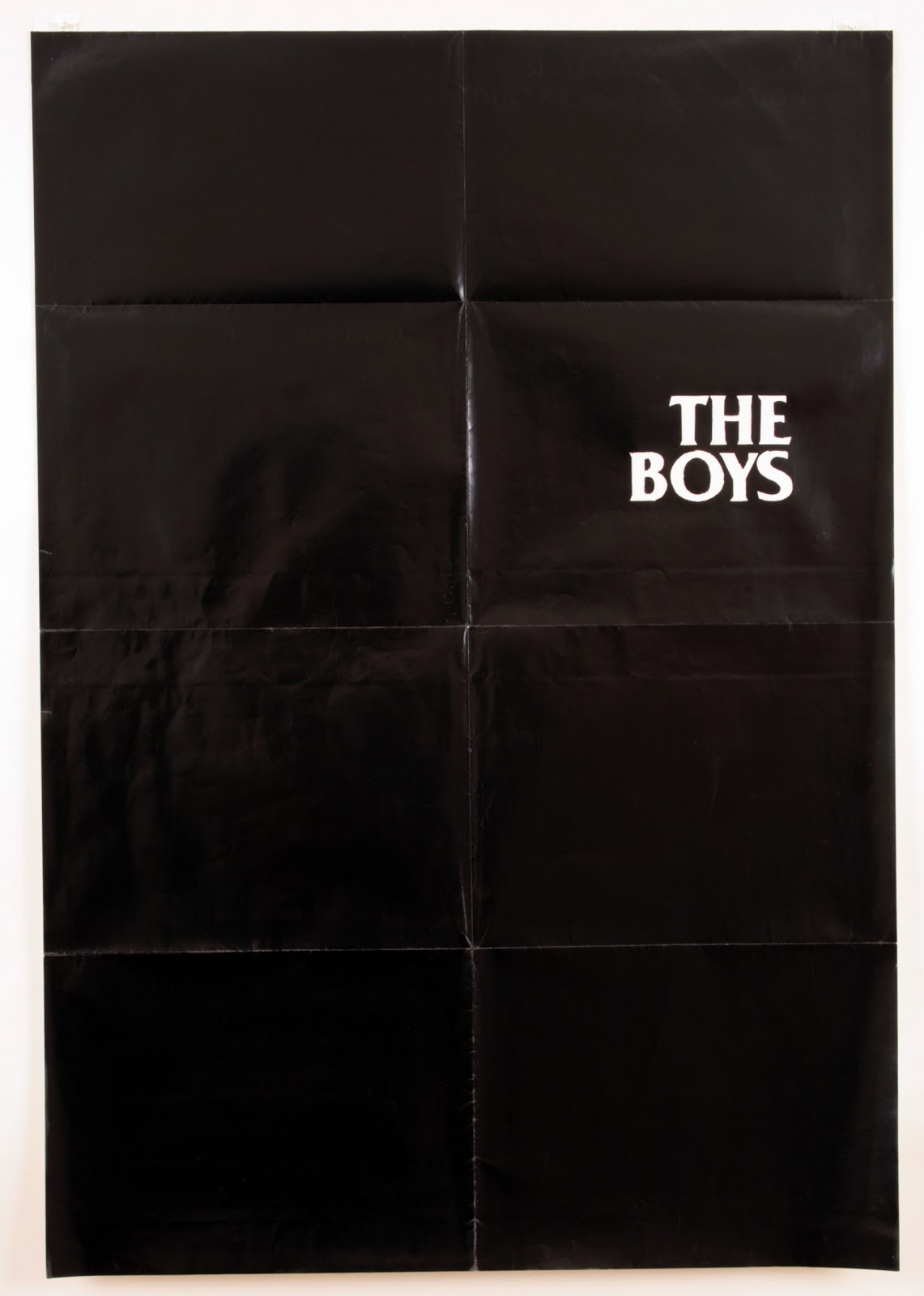
[all Bobbi Woods. top to bottom: The Boys, 2010. Still from California Light, 2010. Fade Out, 2010. Courtesy of the artist and Annie Wharton Los Angeles]

Tuesday, September 6, 2011

Samara Golden


Workspace: When looking at your work, I never know if I'm looking at documentation of a piece, a sculpture, an installation, a video still, or a photograph. Can you talk about the role that confusion plays in your work?

Samara Golden: I have a hard time believing in finality, and especially the finality of the piece. I like the spaces between things, the ambiguity and suspension. For me the sculpture, the installation, the live video, the prerecorded video, the video stills, and the documentation, are all dimensions of the work that exist together with little regard for a hierarchy. As individual elements they both reinforce and undermine each other. I think of them as one thing, the same way a person is a whole person, but they do things like eat, drink, and sleep - no one ever asks them if "sleeping" is all that they do. Why is art making so specialized? To push the metaphor further, why are most artists defined as either eaters, drinkers, or sleepers, instead of simply alive.

In terms of confusion, I try to set up pieces that will organically and structurally build up to a complicated existence that is riddled with contradiction - like frameworks for multiple choice experiences. The pitch I'm trying to hit is an aggressive but subtle un-equilibrium: the mix of emotional harmony and discord that amounts to a sense of internal conflict.

On a more external level, I've always been fascinated by the idea of multiple dimensions in one place: that where you stand now, someone else could also be standing, but you can't see them and vice versa -- The idea that two (or 50?) universes exist at the same time in the same place.


WS: In your Workspace show, there was a video component that fixed a point of view. The live feed video incorporated the viewer into a tableau of "busts" that you had made of all the people you had met with in the making of the piece. What is the relationship between your friends and colleagues and the making of your work? And how do you think about the viewer of your work?

SG: For the Workspace show my idea was to make a sculpture that was made up of representations of everyone who had ever seen it. At the time I thought of it as a piece that was self-generated. I was having many studio visits to discuss the idea, and decided to sculpt busts of those friends and colleagues to incorporate into the final piece. I called that group the "Conversationalists", because I literally talked the piece into being.

Inspired by Heavy Metal Arena Rock Tour VHS tapes, the original Busts Project was intended to go on a "World Tour". At every new venue I would take pictures of the people who came to the show, after which those people would become sculptures and be added to the next show until the piece was one huge group of artists, curators and spectators from all over the world.

The piece was set up so that a viewer would see their own face in a crowd of busts at the exact same scale. It was important to me that the viewer "complete" the piece by being there, and witnessing it. I wanted them to feel implicated, or confused.

After the first show, I realized that the piece was actually quite transparent. I work in a intuitive way, even with a project like this one, that has a clear structure. I never know what my real motivation is until I'm done with the project. I had recently moved to Los Angeles and didn't know too many people - in retrospect the piece can be seen as a direct illustration of the process of meeting people and making friends.


WS: Your work is really maximal. You seem to scour the Internet and thrift stores for material, I am wondering what your research and accumulation process is like. What is your relationship to commerce in the accumulation of all the different elements you use?

SG: First off, I like to go look at stuff, I like to look at how it was made and what it was made of. I like how thrift stores organize things by color, material, and use with no regard for time. You can see a range of similar things made at different times and in different places. It’s a much wider base than you could ever find in a store that sells new things (or a "vintage store").

I like the worst thrift stores. I like seeing things that aren't popular, patterns and colors that are outdated, and once obsessed-over commodities that are now forgotten about. I think of it as subliminal learning and subtle therapy. I've learned a lot about the world from spending time in thrift stores, at garage sales, and looking at things on craigslist and eBay. I know a lot about what people don't want anymore, which I guess is sort of political.

I think a lot about class, both class as in "social class" and as in "classy." Thrift stores are places where everything is second class, where everything was once classy, and for me where there is a potential for future classy, and the possibility of being poor with class. I feel comfortable in the second class, and that’s political.

In terms of commerce, I often treat the sculptural aspect of my work as a display. I used to shop online for things to put in the installations, but instead of buying them, I would print them out and put the prints into the work. I think it’s an interesting way of circumventing the exchange/value system. But, even when I “fake shop,” I look for things that I have a sincere feeling about -whether good or bad. It's not ironic, it's similar to how a painter might use under-painting. Its just the beginning of a larger, abstract story.

More about Busts: My Personal Winter here and more of Samara Golden’s work here

[all Samara Golden. top to bottom: it's so classic to be wrong, 2010. Busts: My Personal Winter, 2010. Busts: My Personal Winter, 2010.]

Monday, September 5, 2011

Davida Nemeroff


Workspace: You started Night Gallery, a nocturnal exhibition space in Los Angeles. It seems like this has influenced your process and more specifically, your show at Workspace.

Davida Nemeroff: Consistently putting together exhibitions at Night Gallery helped me put together my Workspace show in terms of the placement of things and creating a feeling. I was very much against the idea of an “installation.” You were like, “I consider this to be an installation” and I was like, “no, it’s a show!” And Night Gallery is more than a nocturnal space; it’s a sort of surrealist place, a place of paint dripping, a funhouse.

WS: When I asked that question I was thinking-

DN: How the spaces are opposites?

WS: Right. Night Gallery is dark and has black walls, and Workspace is basically a white cube. But you used similar tactics in both spaces.

DN: … And I painted the white space pink.

WS: Laughs. Yes.

DN: It definitely influenced my tactics, that’s a good way of putting it. There were a lot of the same things involved. It had to do with framing, and using the whole wall to frame a piece. That’s how it became an installation because the walls were frames. That understanding of a wall came from smoking a lot of pot at Night Gallery, staring at the walls of the space and understanding what a space is. In terms of color, I found the two colors, the darkness and the magenta, were equal. You could say that they were opposites, but they were opposites to the point of being equals, just because they both took over the white space. Both Night Gallery and Workspace are white spaces- Night Gallery is just painted black. They’re both exhibition spaces that deviate from the idea of the white cube. Workspace’s size or Night Gallery’s hours; those are the mechanisms that you’re working with.

WS: What about the individual photographs in the show?

DN:  First and foremost, Daniel and Paul, you were the first people to show my work in LA, at Workspace Selects. The first piece I made was so bizarre that I could go anywhere from there. I made that watermelon piece with that awful mauve, pink, and gold frame, and it was in the heaviest glass. It was so insane.


WS: That was one of my favorite pieces in that show. And that frame foreshadowed other work that you ended up making.

DN: That piece was way over the top because I really wanted to assert this idea of the frame. I’m interested in the frame, and I’m interested in staring, so the photographs that were in Potpourri, the two images, the picture of the potpourri and the roses, both directly suggest the idea of transfixion. They’re both super formal, they were lighthearted, and they were very pedestrian. One was staged, one wasn’t- what’s the difference? The show at Workspace, wasn’t about women’s rage, it was much more… what did you call it?

WS: Well, there was this Georgia O’Keeffe thing going on, it’s like a vagina, but it’s not?

DN: It’s like a pulsing, vibrating vagina. It’s like a vagina but it is.

WS: It was a clashing of different kinds of femininity. A lot of the things you were working with were feminine kitsch.

DN: I guess that’s the cliché. Feminine kitsch. Right now in my studio I’m surrounded by all of this grayness, but that’s still where I’m at, it’s still the same topic. My work is about the objectification of a subjectivity, creating and showing one way of seeing, breaking up how to see. It hasn’t always worked, but that’s always been my dream. The Workspace show might have been too forcefully through the orifice, I was overzealous about wanting to do that. But that’s what was really great about it, it’s scale, because it was the most outlandish, the pink-est, brightest show that I’ll do for a while.


WS: What are you working on now?

DN. My new work is limited to the zoo. Within the zoo I’ve found a limitation- deconstructing what it is to look at something. So there is this coy structuralist procedure going on. I don’t want to repeat things that have already been destructuralized in looking, I want to add.

I don’t want to be didactic. I don’t want it to be puns, I want it to be poetry. I want it to exist on its own, I want it to work. I don’t want it to be just me that sees it. I’m trying to create a subjectivity for other people. I really feel like how much femininity I was putting into the Workspace show was part of asserting the female, the constantly and continuously misunderstood species. That was part of being a feminist without partaking or aligning myself with any wave of feminism: not apologetic, post-castration, post the ideas of castration, being there. And that’s what the Workspace show was, it was the idea of the average ladies’ night. And then it’s time to get more serious about that. Not about pointing fingers, or fluffing up one’s self or gender, not even taking into consideration the oppression, just moving past the depression.

More about Potpourri here and more of Davida Nemeroff’s work here

[all Davida Nemeroff. top to bottom: Roses, 2010. Invagination: Dusted Pink, 2009. The Ear, 2011. Courtesy of the artist and Annie Wharton Los Angeles]

Tuesday, May 31, 2011

Interview with Walter Benn Michaels

Many thanks to Walter Benn Michaels for the following interview that was conducted from a series of email exchanges during May 23 – May 29, 2011. The interview is in response to Michael’s most recent essay.


How did you come to understand photographic form as possessing a strategy for working through the problems of what you call neoliberal aesthetics and politics? I’m very curious as to how you developed this given your background as a literary theorist and critic.

I’ve always been interested in photography, or at least I have been since I first saw some of Jim Welling’s work at Metro Pictures and then got the University of California Press to commission the cover for my first book, The Gold Standard and the Logic of Naturalism, from him. I could see right away that some of the theoretical questions that interested me in that book – the question of what made some event count as an action and some thing count as a representation – were questions his pictures were engaging. In literary theory, one way to raise these questions was by asking what made sounds in the air or marks on a page count as words – what, in other words, was the relation between the materiality of the signifier and its meaning, what made it a signifier? In photography, it was what made the photograph – importantly understandable as the outcome of an essentially mechanical set of procedures, weak in intentionality, as writers like John Berger put it – count as a work of art.

In a certain sense and especially for photography, this problem has always been around. In the period I was writing about in The Gold Standard, for example (the late 19th and early 20th century), it was raised as the question of whether photography could count as an art if all the photographer did, as the famous ad suggested, was press a button. And the characteristic response was simply to assert the photographer’s agency – the importance of her eye, her sense of composition, her technical skill, etc. The idea was that photography was a medium like any other, like writing even.

But in the period not about which but during which I began to write, this question of the photographer’s agency was being raised in a different tone of voice. Now writers like Berger and Rosalind Krauss were valorizing precisely what earlier critics had attacked. Indeed, photography was increasingly understood in terms of the broader critique of intentionality (associated above all with deconstruction) and with what Krauss thought of as the critique of Art. It was precisely the way in which the photographer’s control was necessarily compromised – by the mechanical nature of the process and above all by the photograph’s causal connection to the thing it was a photograph of (its indexicality) – that seemed (for many photographers and writers) to make the photograph exemplary. But not for me, or for the photographers in whom I became interested.

For them, neither the idea that the photograph was Art nor the idea that it wasn’t was interesting. What was interesting instead was the opportunity or necessity to establish or assert the photograph as a work of art. Paintings, after all, were obviously and irreducibly works of art, their meanings more or less inevitably a function of the intentions of their makers. You could say, and people do say all the time, the painting means different things to different people at different moments. But the theoretical argument in favor of that position is a catastrophically weak one, whereas with respect to objects in the world, precisely because no one means anything by them, the idea that their meaning is a function of how different people see them is much more seductive. And from this standpoint, it’s the photograph’s indexicality -- the thing that ties it to and makes it an object in the world, the thing that induces someone like Sugimoto to call fossils the first photographs -- that must be acknowledged (paintings have no necessary indexical relation to the things they’re paintings of) and that can be overcome. So one easy way to put it would be to say that for many people, photography perfectly embodied the theory and practice of the postmodern, whereas for some people, it created the possibility or felt necessity for a critique of postmodernism. Or, to put the point in terms of intentionality: for many people, the photograph embodies the critique of the intentional that we find in theorists as different as Barthes and Derrida, Crimp and Rancière; for others it embodies something like the opposite – the opportunity to re-imagine intentionality.

If the indexical or causal function of photography is crucial – where a thing in the world becomes depicted in a photograph – are there then forms of photography outside the art context (i.e., fashion, portraiture, editorial, architectural, photojournalism, etc.) that can also serve as a model for working through these problems? Is it photography in general that’s exemplary for what you call neoliberal aesthetics? Or, is intentionality within photography as art primarily the domain in which this model is most effective?

I think it’s only in its claim to be art that photography is crucially important. Of course, there are lots of wonderful photographs, made to convey information, or to sell things, and many of them are very beautiful. But it’s the attempt to make art with photography that seems to me theoretically central and politically important. The theoretical interest is the one I’ve described; precisely because the photograph need not be art and because it need not be (and in crucial ways isn’t) even a representation, it has become the site of the most powerful thinking about what representation is, about what it means to make art and about what art is. And at the center of this is the assertion of the intentionality of the photographer.

Which is also, I think, the political interest of photography. If we think of postmodernism as the cultural expression of neoliberalism, it’s not hard to see that the photograph – understood as necessarily meaning different things to different people – embodies both the commitment to the commodity that’s at the heart of neoliberalism and the commitment to the subject position that’s at the heart of neoliberal models of social justice.

Things that are made to sell are made for – determined by – the buyer; they’re made for the market. And because social justice in the market consists of equality of access to it, anti-discrimination is central to neoliberal justice. Your race or sex or sexuality should not limit your access to the labor market. Hence neoliberal societies are increasingly alert to the ways in which we see each other and seek to prohibit what Ranciere calls “hierarchies of vision” – racism, sexism, heterosexism. But they’re not much worried about the hierarchies that have nothing to do with vision – the hierarchies produced not by inequality of access to markets but by the markets themselves. That’s why our efforts to make society more equal with respect to race and sex have happily coexisted with greater inequalities of class.

And the inequality of class, of course, is not dependent on how people see us. So the difference I outlined above between two ways of thinking about the photograph – its meaning determined by the way the beholder sees it or its meaning determined by the intentionality of its maker, regardless of how the beholder sees it – is paralleled by two models of inequality. The inequalities of discrimination are determined by how we see each other; the inequalities of exploitation are not.

What this means is that the photograph’s claim to autonomy, its claim to be something other than a commodity, has a kind of political value. It’s not that you don’t want the work to sell – you can’t live if you can’t sell. It’s that the price may be determined by the buyers but the meaning isn’t determined by the beholders.

The importance of indexicality and causality between the thing that is photographed and the photograph itself seems to be crucial in how you conceive of form. Your conception of form is not the one typically associated with physical characteristics – frame, surface, color, size, etc. – but with the intentionality of the artist. Could you elaborate on this concept?

Yes, you’re right but it’s not that form isn’t physical, it’s that it isn’t just physical. Everything in the world has a shape, everything has color, but the work only has form when shape and color begin to mean something. Everything either looks pretty good or not so good, but it’s only when the way it looks begins to signify that you have form. So in a way, it begins to make sense to think of form as invisible, by which I mean not that you can’t see it but that it’s not reducible to what you can see. Which is, I think, why a lot of really interesting younger photographers (Viktoria Binschtok and Arthur Ou, for example) are interested in different ways in what can’t be seen or in the photograph as an obstacle to the visible. And that’s why, today, it also makes sense to associate form with class, since the materiality of your class position consists precisely in its irreducibility to what you look like or how you are seen.

In 1981 the artist Martha Rosler wrote that documentary photography developed to become representative of the social conscience of liberal sensibilities as presented in visual imagery, where its rhetoric was most suited for moralism rather than the possibility for actual change in the subjects that it strove to depict. Is there a relationship where certain forms and discourses around photography contributed to the intensity and edification of neoliberalism as we know it today?

It’s probably true that even the most powerful documentary photographs are more likely to induce gratifying feelings of moral superiority in their beholders than changes in the situations of their subjects. And it’s probably also true that photography has played some role in the more general collapse of politics into ethics. But that’s another way of getting at the fact that photography has more political meaning as art than as documentary, more political significance when it seeks to be beautiful than when it seeks to be relevant. (That’s why work like Michael Fried’s on why photography matters as art is more politically interesting than most of the work on why it matters as politics.) On the one hand, it’s perfectly true that if what you want is changes in policy, you’re not likely to get them from art. On the other hand, if what you want is a vision of the structures that produce both the policies we’ve got and the desire for alternatives, art is almost the only place you can find it.


[Above: James Welling – August 16a (B78), Gelatin Silver Contact Print, 1980]

Tuesday, March 1, 2011

Minna Pyyhkala


work by Minna Pyyhkala. see more from Hi Die here.


(top) Roosa Parha and Leevi Jokela, age 9, students, Finland (2004)

DO YOU FEAR DEATH? Mine no, but if for example my mother dies, I would feel sad. DO YOU BELIEVE IN LIFE AFTER DEATH? No. Is there such thing? You can't even stay in heaven, you'll drop down! WHAT SCARES YOU MOST ABOUT DEATH? To get inside the dirt, the coffin must be hard to lie in. DO YOU THINK ABOUT DEATH? No, I don't think about it, I usually do things, not think about the future. IF YOU WERE TO DIE TOMORROW, WHAT DO YOU REGRET NOT DOING? I would regret having not finished my school, and not having a cross-motorbike. I already have a moped. (Leevie Jokela)


(bottom) Sheridan Whitney, age 36, psychic, USA (2005)

DO YOU FEAR DEATH? No I am not afraid of dying. I am afraid of the people I love dying and what life would be without them in it. DO YOU BELIEVE IN LIFE AFTER DEATH? Yes, I absolutely believe in life after death because I believe in the soul which never dies and is a part of God and divinity. WHAT SCARES YOU MOST ABOUT DEATH? What scares me the most about death is dying painfully. I use to be haunted by Edgar Allen Poe's poem about being buried alive, which is why I want to be cremated. Then there is no room for mistakes! DO YOU THINK ABOUT DEATH? I do think about death because it has been such a part of life. So many people I have known have died and their loss stays in my heart. But I know that death is a part of the cycle of life so I accept it, but it doesn't make it any easier when you are affected by it. IF YOU WERE TO DIE TOMORROW, WHAT DO YOU REGRET NOT DOING? I would regret not having lived my life with more courage to choose things for myself that I believe in. I have spent so much of it trying to fit in and please other people. Which in the end never pleases anyone.


Saturday, January 15, 2011

valerie green


Recently, rather than taking photographs you deal with the materiality of photography, whether it's the symbols on rolls of film or material (Sintra) on which photos are commonly mounted. Can you talk a bit about your relationship to photography and exploring the non-image side of it?

You seem to be suggesting that my practice emphasizes the ends of a linear process when in fact I’m more interested in the cyclical nature of photography. There are many “non-image” aspects to photography, but they are no less photographic than a photograph. I make photo-based sculptural work. It began with photographic cutouts arranged in space, and led to the current pieces we are focusing on here, the photograph-less photo-based work.

After spending some time researching various types of storage devices, I began to think about photography specific containers and the various devices/image supports used in the life cycle of a photograph. Film is inherently a container of light and time. The film backing paper is the material that initially supports the actual container. Sintra is the material that supports the image. 2 ¼ at 103 ¼ is a recreation of the information printed on the backing paper that supports a roll of 120 film (Fuji NPL to be exact.) The components were scored on a CNC router and finished by hand with a box cutter. Applying the information from the backing paper to the gallery, makes the walls the image support structures and the contents within the space of the room become the “image.”

In “an untitled cloud” you mount the material used to back photos in a cluster with the corners of each piece curled, disrupting the possible flatness of the image. I'm wondering if you can talk about the absence of photography in “an untitled cloud” and the ideas behind the curl of the surfaces.

Photography is not absent in “an untitled cloud.” It’s just not visible. This piece is made up of 29 separate parts sized according to standard paper and photo paper sizes. The initial shape is based on the document icon on the computer. More specifically, it is a blank or corrupt document icon. If an image file has been corrupted, there will be no descriptive info on this icon. For example, most jpeg files are the document icon with the jpeg overlay. The icon is designed to look like a piece of paper with the corner curled up, a 2 dimensional-digital representation of a 2-dimensional object in 3-dimensional space. I wanted to play with this inter-dimensional back and forth to see what would happen when the representation is exported back into three-dimensional space as a rigid object.

Photographs often don’t even make their way out of the computer. They may never really exist physically in the world. But now, they may make their way to a “cloud.” The branding of cloud server technology relies on the notion that clouds can be anywhere and everywhere. That they are light and don’t really take up space. I find it funny that one can imagine all of their valuable data floating effortlessly above them and accessible at any given time, when the truth is that clouds are, by nature, ephemeral and can disappear at anytime. This is not the most reliable metaphor for information storage. The weightless cloud is really a huge, server filled warehouse that requires energy to be maintained. There is nothing light and airy about it.

In your earlier work you explore what a photographer encounters before she or he takes a picture--the film itself. What does your focus on the “before” and “after” of the actual photograph mean, for you, in terms of leaving the space of the photo itself a blank?

I don’t think I have left the space of the photo itself blank. There is a difference between blank and not yet filled with information. In actuality, I don’t know if it’s even clear what “the space of the photo” means anymore. Is that space on the film? Stored on a hard drive? On a blog? Is the space the time held within the photograph? Does a photograph have any actual physicality at this point? The physicality of the photograph transforms/changes as it uploads and downloads, as it compresses and expands, as it moves from one screen to the next.

You can find more of Valerie's work here.

Friday, January 14, 2011

suzanne mejean


The still photographs taken alongside Suzanne Mejean’s Still Here film documentary feature the subject of the documentary--the flat daddy. Flat Daddies are life-size cardboard cutouts of military service members ordered by their families so that the families can have the service member around, in attenuated form, while the family member is deployed overseas. As such, both the photos and the film speak not only to ideas of loss and memory but of our relationship to images as stand-ins for the real thing.

What’s key in the the images Suzanne and I chose for I Heart Photograph is not the memory but the failure of the flat-daddies to be adequate stand-ins; rephotographed in a variety of conditions, the flat daddies seem more like markers of absence than a useful kind of presence. The way each family uses its flat daddy is explored in more depth in the film, but in Mejean’s work the flimsy nature of the flat daddy photos, the difficulty of having a relationship to them and by extension the tenuous nature of memory and presence all come to the fore.

You can see more of Suzanne's work here and here.